How and where do you communicate with prospective customers?
The main focus of most marketers and salespeople these days is on using social media as a means of connecting with their audience. However, there’s another way, the lead generation effectiveness of which can compete with Instagram, LinkedIn, TikTok, and Facebook.
It’s email.
You must work well on your email newsletter design to use this communication tool as effectively as possible. Mail is a platform where visuals are of great importance, so an ordinary message will not be enough to attract the attention of a larger audience.
In this article, we will discuss the features of email newsletter design and describe the 11 best ways to create an effective final result.
Outline:
What is email design?
Email newsletter design is the strategic creation of emails that consider the characteristics and needs of your target audience, which consists of both potential and existing customers.
Creating a newsletter design includes effective placement of CTAs, correct distribution of text and display of information in appropriate places, selection of images, use of the corporate style, and many other points.
Why is email design so important?
Emails that do not carry any valuable information for the user are often ignored or deleted. Email design helps turn an annoying mailing that no one needs into a practical tool for interaction with the client. An effective email disegn should be visually appealing, attention-grabbing, and consistent with the brand’s philosophy.
Best email design practices
1. Pay attention to the preview
Pre-header is a piece of text visible right after the subject line in the inbox or at the top of the email template when the message is opened. It’s usually either left unused or wildly underused. But by experimenting and optimizing the preheader text, open rates can be boosted by 45%.
The email pre-header is one of the first things your user will see while opening the inbox. This short sentence will give the recipient a general idea of what the email will be about, its purpose, and whether it’s worth opening and reading at all.
Instead of simply rewriting the email’s first sentence, try making it more appealing to your customer. This will increase the chances that the user will not only open the email but also read it and interact in some way.

A quick summary of what the newsletter is about will be more useful and grab the attention of your potential clients. This can be in the form of a leading question or a list of topics to be covered in the email.
2. Create branded emails
The email is a vivid reflection of your marketing strategy. To achieve the goal and increase the company’s visibility, apply branding even in newsletter emails. Your recipients should immediately recognize your email among others. Keep in mind these three aspects:
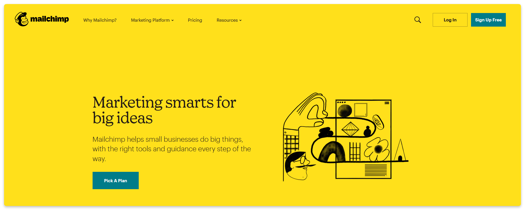
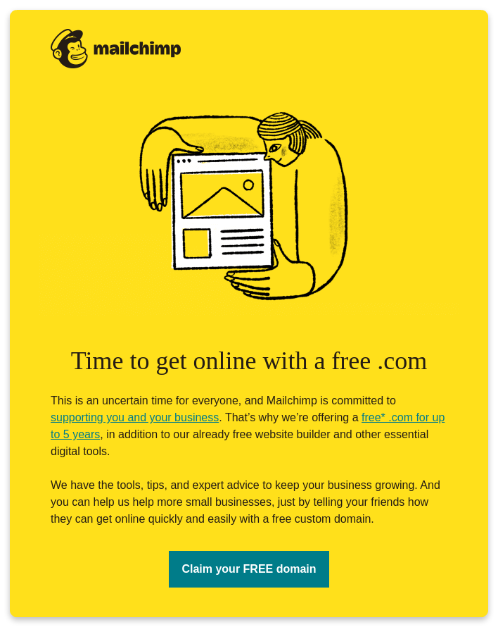
- Synchronize your email design with your other content. Keep the same font styles, colors, and identity in all marketing elements. Adding a logo at the email’s beginning or end will be a great way to emphasize your branding.
- Use a specific recognizable tone. Include your company’s famous phrases and ways of communicating with the audience. You can also add inside jokes and use emojis.
- Include links to the social media accounts and the company’s website. This will provide user with a deeper understanding of your brand and improve your email campaign performance simultaneously.
3. Don’t forget about the user’s experience
Your email design should be well-structured and easily comprehended by the potential customer. The best email design will provide a good balance of text and visual elements and follow the information hierarchy using an effective layout.
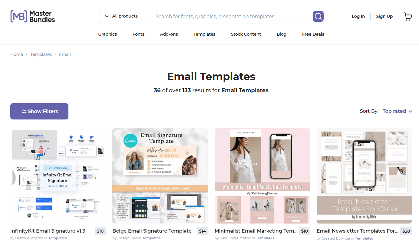
Email templates are a great solution that helps with all these tasks and keeps your user satisfied. You can use them for inspiration or personalize them to suit your needs. The guys at MasterBundles have more than a hundred cool email templates you can choose from to simplify the process of creating email campaigns.
Another email feature you need to keep in mind is that they usually require scrolling down the screen. Accordingly, the content should be evenly divided.
To achieve this, add a lot of white space, lists, and subheadings highlighting the key information. The most critical points, such as CTAs, should be placed at the beginning and near the end since the user remembers the first and last perceived information best.
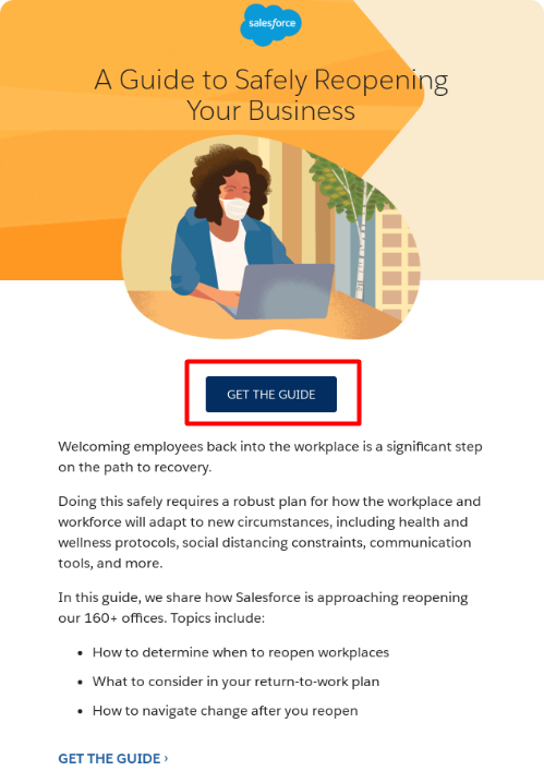
In any case, a quality layout helps structure the information in the email and makes it more readable for the user.
4. It’s not all about the visuals
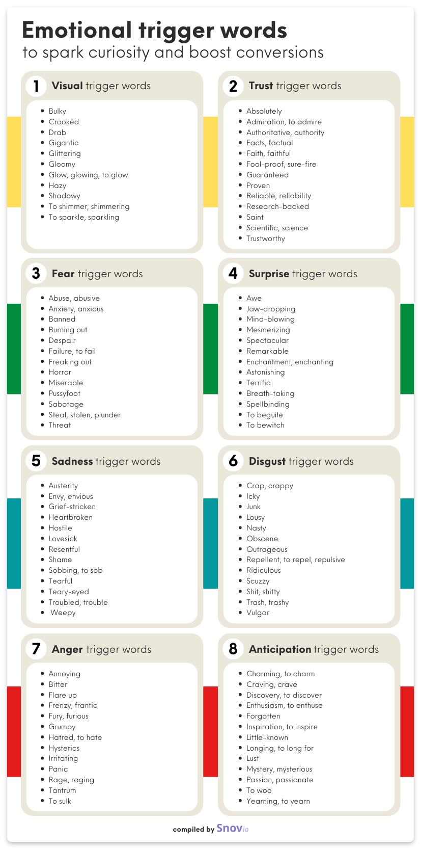
Emails are a balanced mixture of good text and visual content. This is why you should spend as much effort and time writing the email text as selecting illustrations and creating a layout. The text should interest the user, speak to them using their language, and do it in a friendly tone. To get an excellent result, use persuasive words and phrases that can help you boost conversions.
5. Be more personal
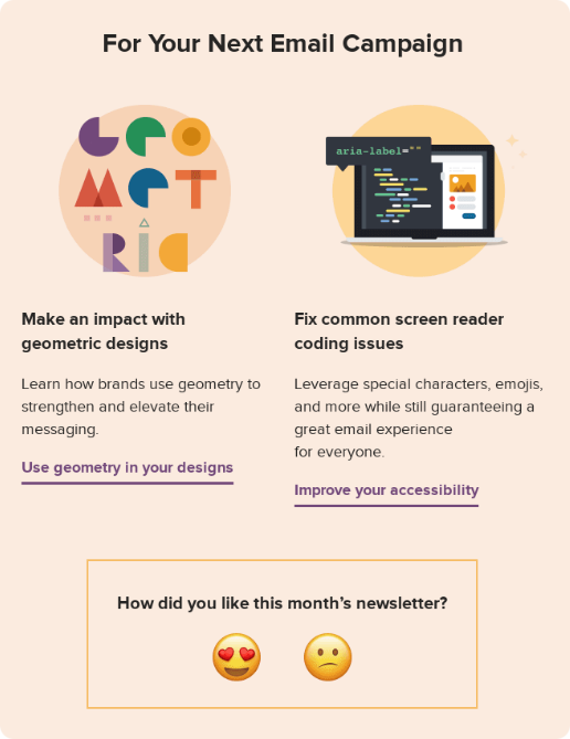
Use personalization to make your newsletter design stand out from thousands of identical emails. Include the name of the recipient and other important information your company has access to, such as buying history or saved items.
Another way to go is to add a place for receiving feedback from the user. Include a function to evaluate how helpful the email was this time. Based on such responses, you can easily adjust your personalized mailing. As a result, your emails will look more thoughtful and add warmth to your communication with a client.
6. Add more visual content
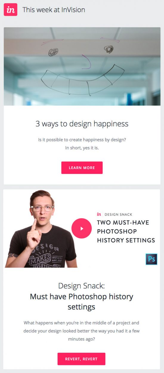
We have already suggested adding your logo and keeping the balance between text and visuals. This advice is worth considering because paragraphs of information won’t keep the potential client’s attention for too long. You can easily separate the informational content using branded animations, videos, and other creative materials.
It’s necessary to remember that the theme of visual content should directly reflect your company’s identity. Any inserts are also part of your brand, so you shouldn’t overdo it with gifs or emojis just for fun. Instead, add an informative video about new services, visualization of discounts, or photos of new products to the email to improve your newsletter design.
7. Provide a responsive design
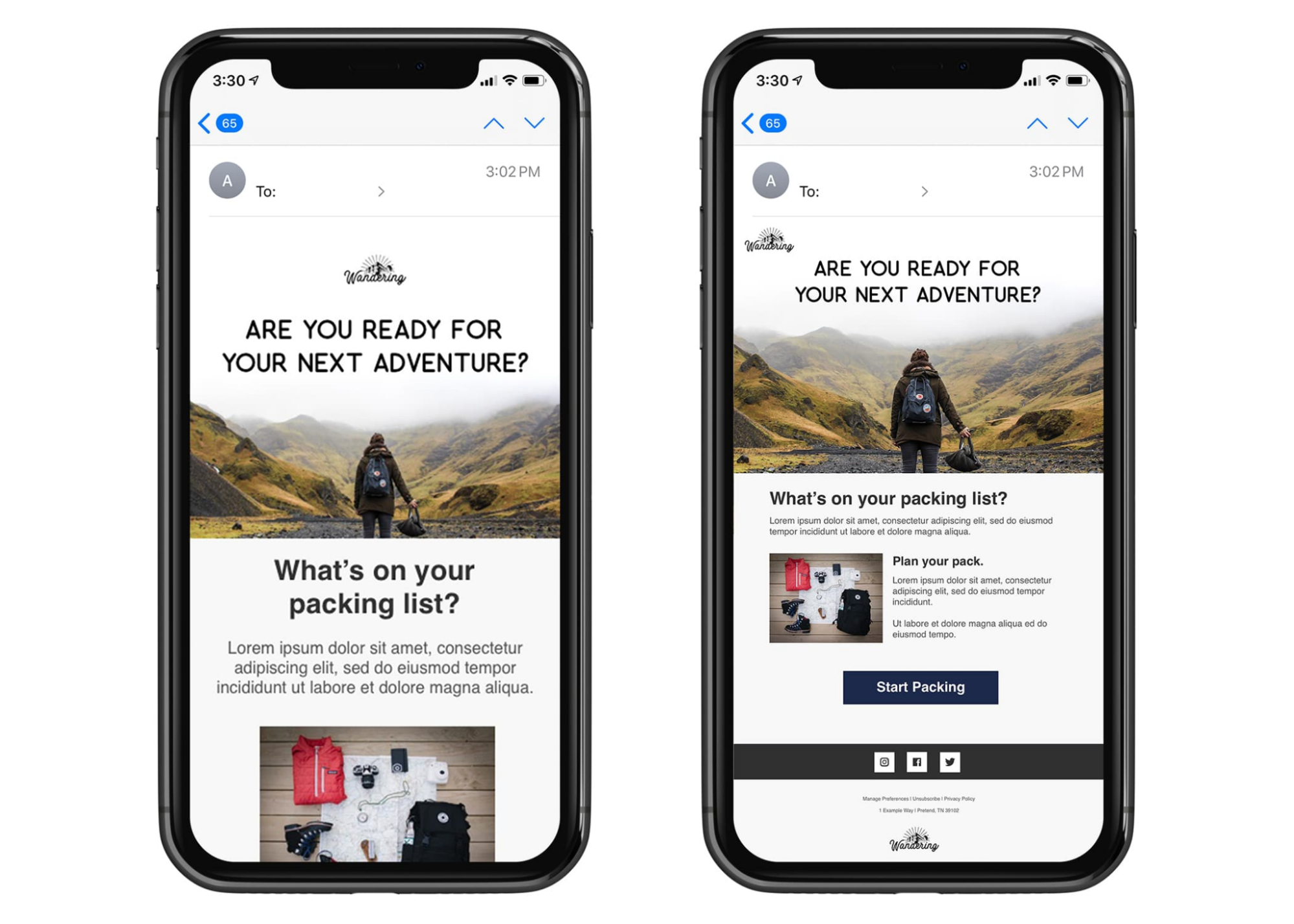
Forgetting about different screen formats is a common mistake in email design. A responsive design considers the user’s screen and changes its format accordingly. This way, customers can view the email using any device.
Do your research and find out the most common screen formats of smartphones, tablets, and laptops of your users. Based on these results, adapt the newsletter to popular devices and test it using mockups. This also applies to pre-headers, which should not only attract attention but also look accessible for perception.
8. Use effective color schemes
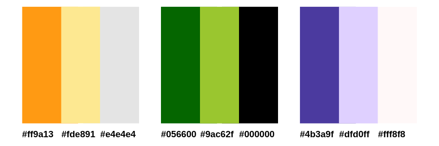
Suppose your email has a large number of CTAs and the topic is related to sales and new product releases. In that case, it is worth turning to bright colors that stimulate the recipient to action.
According to a HubSpot A/B test, red increases conversions by 21%. However, it should only be used to highlight text in the general email color scheme. If all your email design is in red, it won’t help your CTA. Red works best with the most basic colors, like white and shades of gray.

As an option, you can use complementary colors to add contrast and emphasize the main details of the email. In order not to resort to risky combinations, use lighter and darker shades of the same corporate color and compare email engagement.
9. Work on your email sign-off design
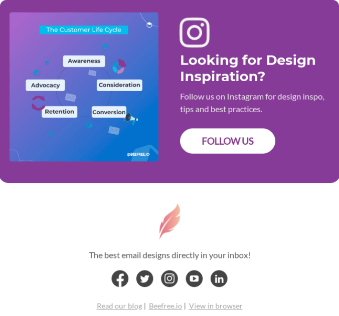
The end of the email is as important as its beginning. This part should be informative and beneficial for the recipient. It’s not enough to simply include your company’s name and wish your customers a good day. A better way to fill this space is to add some contact info, your role, and your full name.
Besides, it’s common to insert the company’s logo at the beginning or the end of the email so that the information received by the recipient is automatically associated with your company. It’s also essential to indicate possible communication channels with you or with customer service.
10. Don’t be afraid of the “unsubscribe” button
Do not hide this function from your recipients. Your audience is a dynamic component of the business, and it’s natural that, at a certain point, your newsletter might cease to bring any benefit to the user.
To avoid annoying customers with aggressive, intrusive marketing, add a well-visible “unsubscribe” button at the end of the newsletter. This way, the recipient will understand that receiving this mailing is a free choice, not a compulsion, which usually repels them. This will also filter out the uninterested part of your subscriber list and make a positive last impression on the user.

11. Be creative
We have listed many rules related to the structure and content of the email newsletter design. Still, you should not forget about your own approach.
Treat the making of a newsletter as a creative process, get ideas from other companies, and don’t be afraid to move from vision to reality. It’s not always bright colors and the correct placement of information that attract the recipient’s attention, but your creativity and the final result.
To add something creative to your email design, try new templates, look for unusual ways of structuring information, and experiment with graphic elements.
You could even tinker with new tech to make your emails look unique, perhaps choosing to craft AI art which helps keep each message fresh and engaging. Creative twists like this can help you stand out from rivals.
But don’t forget that after such changes, it’s important to monitor the user’s reaction and the campaign’s statistics. Note what has worked and what is better not to use in the future. This way, over time, you will collect a set of proven creative tools from which it will be easy to craft an effective newsletter.
How to create beautifully designed emails with Snov.io
To begin with, click this link to register for the Snov.io toolbox’s free lifetime access. You will have access to lead generation tools and an email drip campaign builder, which will help you find, qualify, segment your audience and guide your prospects down the sales funnel to achieve your marketing objectives.
Open the drip email campaign builder. You can directly insert your HTML templates into the Email element to create nicely designed emails.

Check out our tutorial on how to set up an email drip campaign if you want to learn more about crafting effective email campaigns.
Wrapping up
Email newsletter design is a complex approach to maintaining effective communication with your clients. When creating it, you need to consider both textual and visual design, effectively work with links, and meet your user’s needs.
Don’t be skeptical about it; applying these tips will help you achieve your company’s marketing goals and ensure more efficient growth.
